What Real Fake News Says about Obama’s Presidency
Analyzing the Onion's coverage of Obama's presidency.
Obama & The Onion

Fake news is nearly an epidemic. Some argue it tipped the election (others disagree), Facebook has dedicated significant attention to minimize its spread, and viral misinformation has swayed financial markets.
But fake news hasn’t always been such a villain. Even deliberate fake news contains insightful commentary on current events and entertainment. Political satire, in particular, plays a powerful role in freedom of expression.

To illustrate this, I collected every story The Onion wrote about Obama during his presidency as determined by their ultimate Obama farewell, Black Man Does 8 Years. The Onion is perhaps the stalwart of written political satire and what I deem to be “real fake news”: dependably entertaining, but reputably fake. (Though even this deserves an asterisk as current White House Press Secretary Sean Spicer recently deleted a tweet that commended an Onion article chiding him.)
While The Onion included 322 works on Obama in their feature, I narrowed my analysis to only include written stories, thereby omitting a combined 60 graphic and video productions. Of the remaining 262 stories, The Onion wrote about Obama at a fairly uniform rate over time.
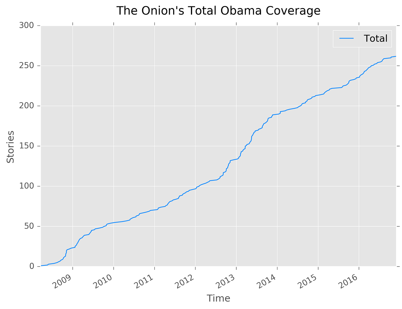
There’s a notable early increase between the initial 2008 Democratic primary and subsequent 2008 presidential election, which follows traditional coverage patterns from primary to general election candidacy. The Onion enjoys their electoral writing, as coverage rapidly increases in late 2012 heading into Obama’s second presidential election. Headlines during this era reflect this, including Obama Takes Out Romney With Mid-Debate Drone Attack and This May Not Be The Ideal Moment Politically, But It’s Time To Talk Reparations. Throughout 2013, stories continued at a high rate, documenting Obama’s difficulty grappling with instability in Syria and lifestyle stories focusing on Michelle Obama and the Obama family.
Every story The Onion publishes includes up to five different tags that editorial staff determines are relevant to the story’s content. While 89 unique content tags were used, the top ten content tags represented 79 percent of the total tags. In other words, there is a substantial concentration of similar content (as determined by the tags The Onion uses).
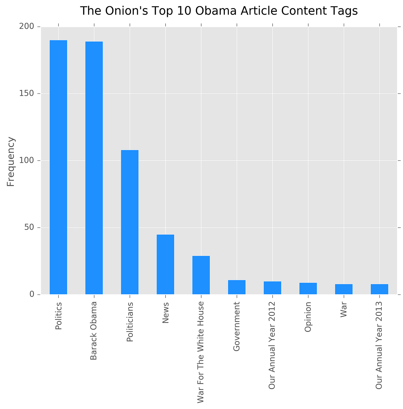
This is reasonable. The purpose of tags is to consolidate information into a coherent set of lists. The specific tags used are not startling: “Politics,” “Barack Obama,” “Politicians,” and “News” make up the lion’s share of even the top ten most used descriptors. It appears, however, The Onion considers their Obama coverage to be some of their best, at least in the middle of his terms. “Our Annual Year 2012” and “Our Annual Year 2013,” which are roundups of top stories, both make an appearance in the top ten tags.
Whenever The Onion begins a story, they note the location followed by an em dash. I pulled location out from each story, only to find Washington makes up 73 percent of all stories. However, there were intriguing anomalies among the listed locations begging for further investigation.
1. Everywhere in Space-Time Simultaneously

3. Kalona, Iowa
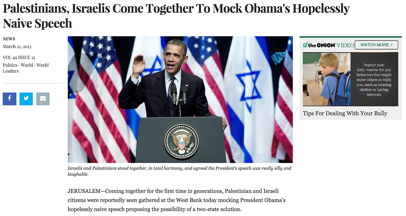
4. Jerusalem

Sometimes, outliers are quite fun.
Text Analysis
Given a dataset of 623,270 words and 262 unique stories, I applied a series of text analysis techniques. I completed a process known as count vectorization, which is a fancy way of saying I counted the occurrences of how often a given word appeared across stories. I removed any frequently occurring terms (stop words) that don’t add insight as to what a story is discussing (e.g. this, a, or, an). I also provided the ability for word counts to take into consideration two consecutive terms but be counted as a single entity. For example, “White House” is two words, yet those two words occurred next to each other so often the entity (called a bigram) was among the most commonly used in all stories. Finally, I separate the counts into Obama’s first and second term: 134 stories were from Obama’s first term, and 128 were written during his second term. I defined Obama’s second term to start on his second inauguration: January 20, 2013 (though he was publicly sworn in on January 21).

There are not too many surprises in the words The Onion used in their stories about Obama during his eight years as president. First term presidency word counts often outnumber the second term across categories not only because there were six more stories during the first term, but more importantly, because the average story length was 212 words compared to 163 words in Obama’s second term. Even despite this, both “White House” and “house” slightly edge out the first term in usage.
There is one key takeaway, however. Based on the number of times “American” was used in stories about Obama’s first versus second term, The Onion shows Obama was half as American during his second term compared to his first. (By this logic, he was also half as “Barack Obama” and “years.”)
“The Onion shows Obama was half as American during his second term compared to his first.”
I investigated what truly separated Obama’s first term from his second, as dictated by the words in The Onion’s stories. To do so, I built different models to most accurately predict in which term any given story may have been written. I trained my model on one random collection of the stories, where it could learn what words most likely are used in articles from Obama’s first or second term. I then tested my model by selecting a separate set of random stories the model had not seen before, and asked my model to make its best guess as to in which presidency the piece was written.

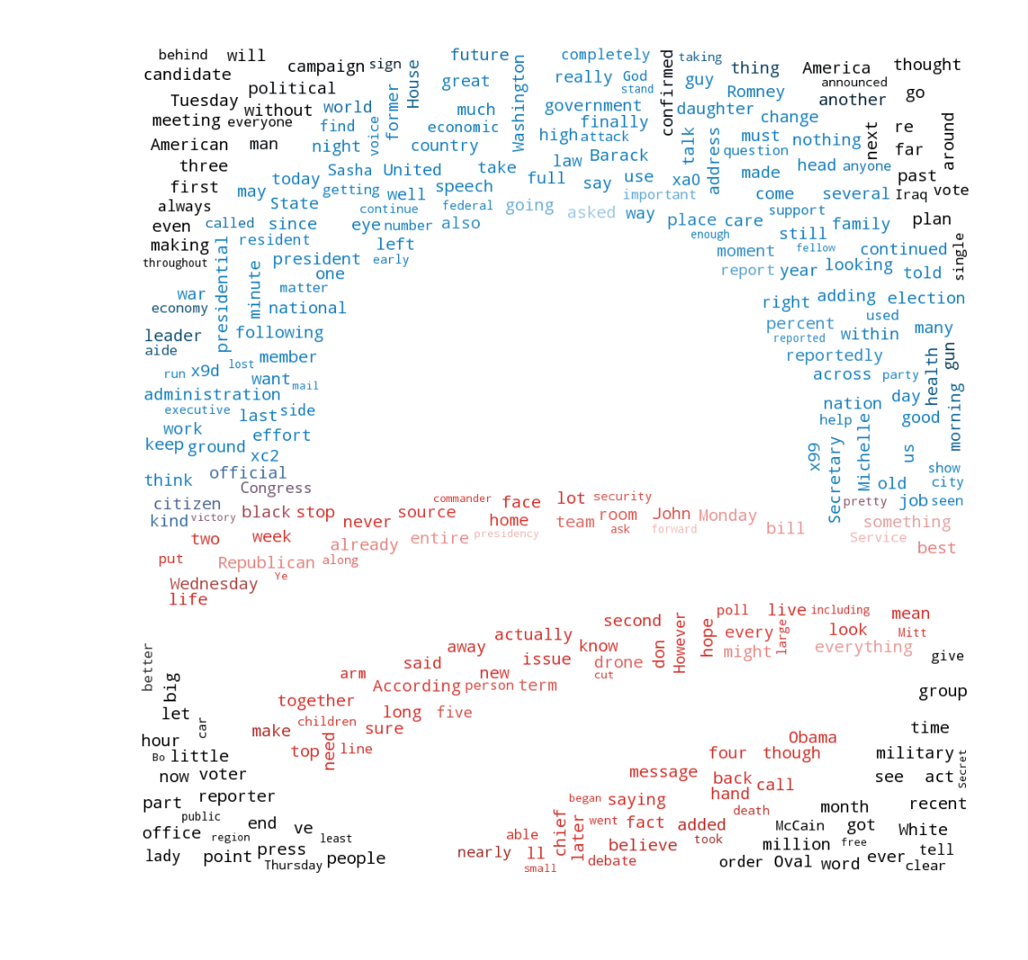
My best model achieved an 80 percent accuracy — about a 30 percent gain over guessing at random. (For the math-inclined, the model was a multinomial Naïve Bayes classifier.) However, this particular model makes viewing which words best define one presidential term versus another quite challenging. Thus, I also built a separate model called a random forest, which is a fancy way to find the best possible decision tree. Decision trees make viewing which words split our stories between Obama’s first and second terms quite transparent.

In the above graph, I’ve plotted the 15 (of 5825 available to the model) most distinctive words between Obama’s first and second terms as determined by Gini Impurity. The higher a word’s or bigram’s (collection of two words) Gini Index, the better it is, on average, at delineating between Obama’s first and second term. In this case, words related to campaigns are quite strong. This makes sense: both of Obama’s campaigns occurred prior to his second inauguration. These results are imperfect, however. This random forest achieved an average accuracy of 64 percent.
Sentiment Analysis
Satire is a famously difficult area for text processing. Consider how challenging it is to decode a friend’s sarcastic text message. Even when considering all context of the situation and how well you know your friend, miscommunication occurs. The problem is amplified for computing, as a computer learning context is a grand endeavor.
Nonetheless, I used a standard sentiment evaluation tool to analyze The Onion’s Obama coverage. This particular Python library tabulates pre-determined word counts and assigns a score. For example, words like “gross” and “bad” decrease a document’s score, while words like “happy” and “amazing” improve its score. Sentiment scores are bound between -1 (negative) to +1 (positive).
I calculated the ten-story sentiment rolling average over time. In other words, I scored the sentiment of ten stories, and then plotted a point for those ten stories. I repeated this across time, adding in a new story and dropping the oldest. A rolling average helps smooth an otherwise uninterpretable gyration of spikes.
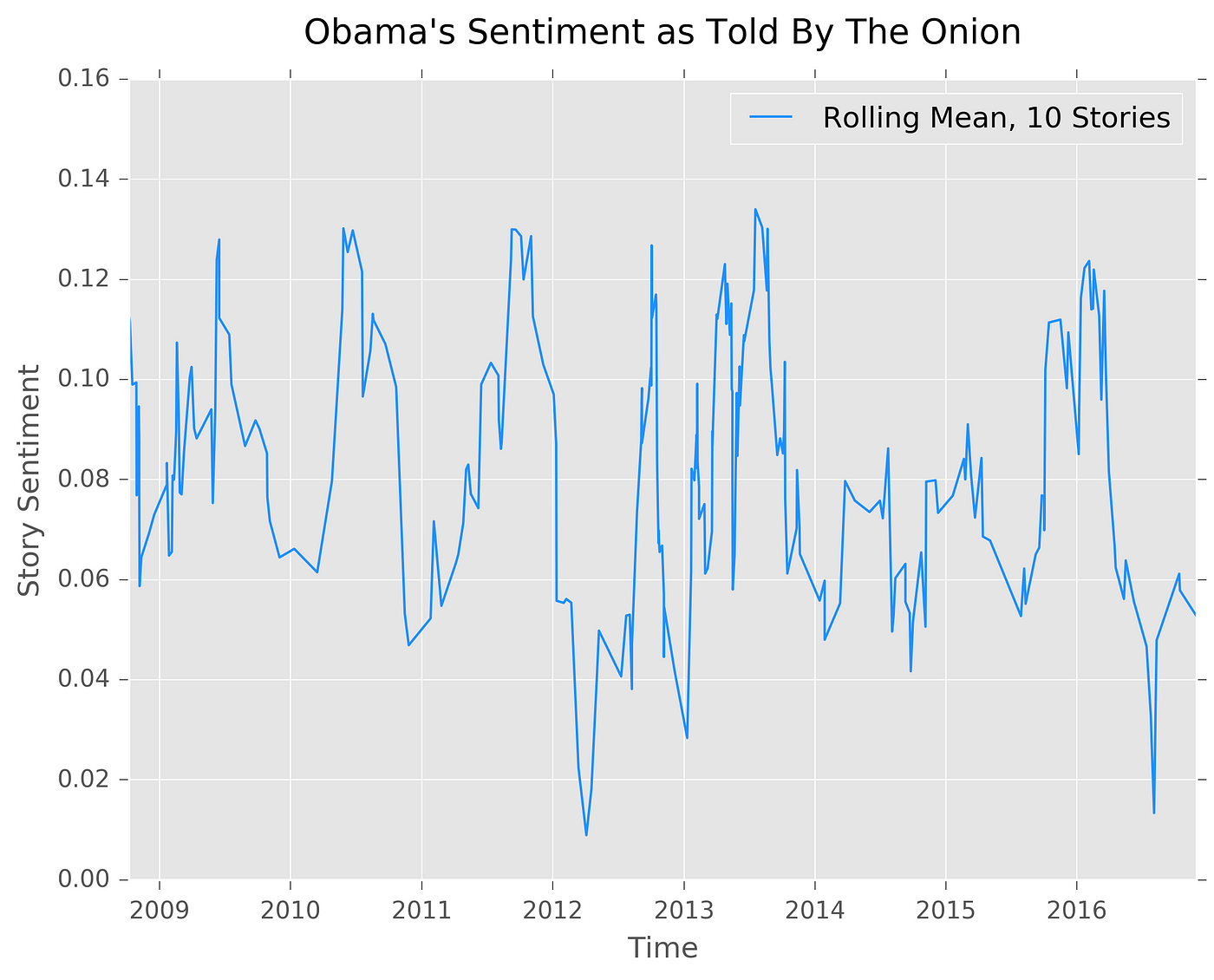
Even my rolling average is still quite variable. Nonetheless, it is insightful to see that a ten-story rolling average never dips below zero. That is, coverage is generally positive. Miscellaneous stories like Obama wanting to see Lebron in Chicago or the White House hiring a jester drove an early 2010 positivity spike. The late 2011 and early 2012 negativity dip included stories about Obama’s major gaffe forgetting to “dumb it down” and stories about the healthcare rollout.
I also calculated the average sentiment as per The Onion content tags discussed previously.
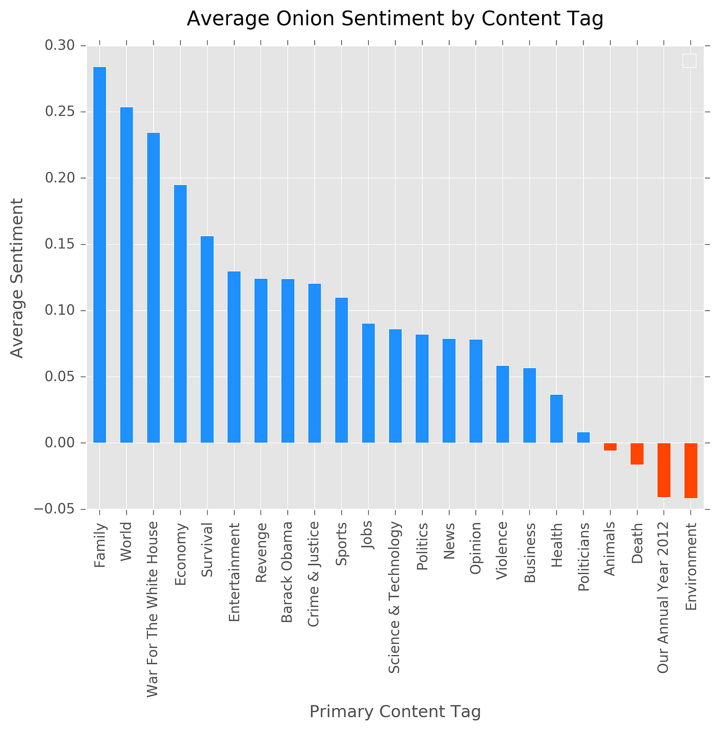
Despite being satire, the most popular tag matches a frequent assumption about the American presidency: the family is typically off-limits for impolite word choice. However, despite this potential real world takeaway from fake news, Obama’s worst sentiment topic-area is “Environment,” yet he’s been praised for his achievements in this area. Moreover, negative sentiment for “Our Annual Year 2012” contradicts Obama’s relatively high 2012 approval ratings.
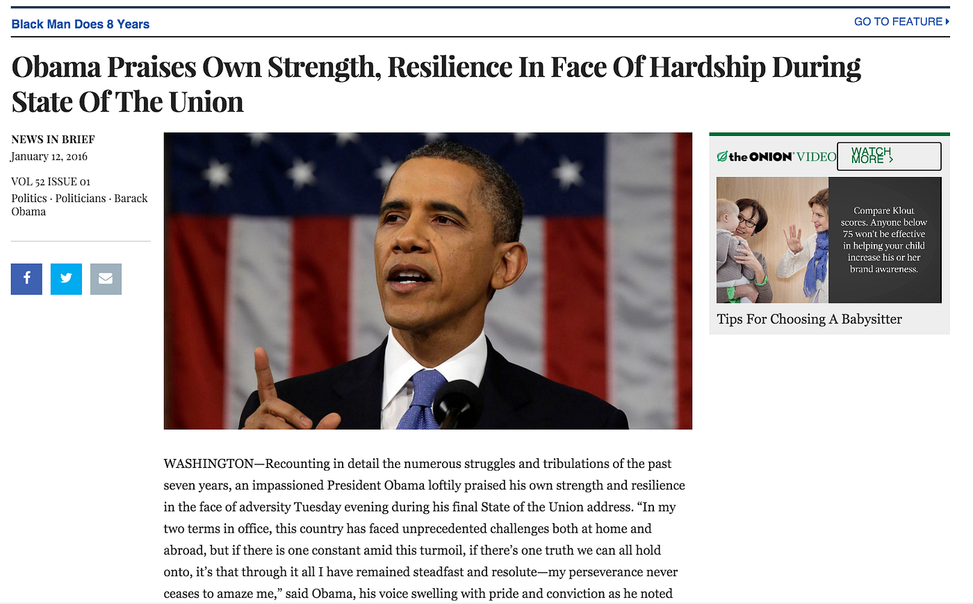
I, lastly, pulled Obama’s most positive and most negative story. Obama’s most positive story earned a 0.323 sentiment score and came on the heels of his final State of the Union.
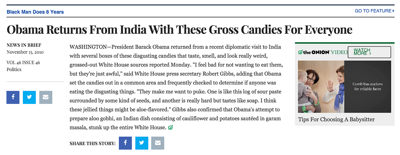
The Onion’s most negative sentiment story earned a -0.226 sentiment score and was published following Obama’s 2010 trip to India.
Obama’s eight years provided great fodder for The Onion: he rapidly passed a stimulus package, overhauled the nation’s healthcare system, and carried a relatively youthful persona. The Onion excellently balanced backhandedly praising his successes, poking jest in his mistakes, and making him appear relatable.
Ultimately, fake news requires vigilance on behalf of the reader, and an increasing number of tools to fight its spread. Nonetheless, deliberate satire, especially from a classic publication like The Onion, is a reminder that dispelling all fake news threatens entertainment and witty commentary. And while even The Onion admits the unpredictability of the recent election has made satirizing the news challenging, I look forward to seeing how they cover the next presidency. It’ll make for great data.
My full analysis, including the dataset and methods not covered in this write-up, are available on my Github. If you’d like to stay up to date on tutorials of how I completed this, subscribe to this publication.